Archie Sunday: Betty of Suburbia

Whoa, a totally punk Betty comic! The Green Day concert in Riverdale was canceled, so she's protesting by throwing a Molotov cocktail at the Starbucks!

Sure, Green Day is a bit of a dated reference, but Archie comics are always about ten years behind in their pop culture references.

No wait. Hold on. Let's do a little CSI zoom in.

Sigh. Oh, Betty. You've really given up and just accepted that you're a total square.

As you can probably guess, she basically spends the whole story recycling.

I Hope They Put Bloodstrike In The Sequel.

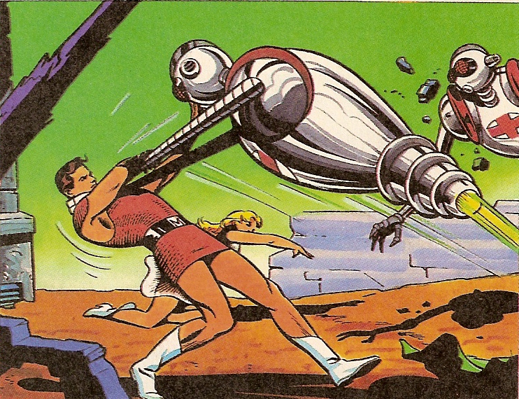
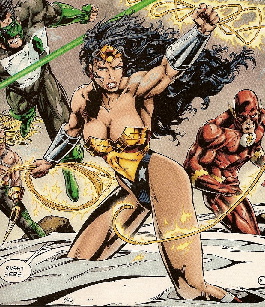
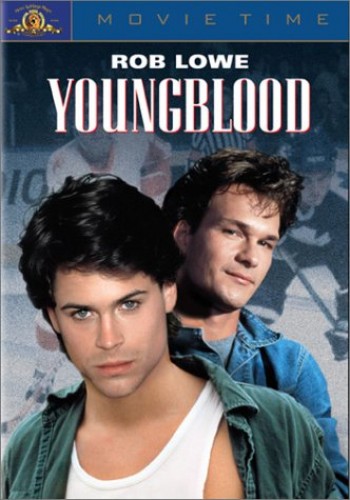
One of the weirdest, couldn’t-make-this-up-if-you-tried announcements to come out of this February’s New York ComiCon was the news that Brett Ratner—the director of shameless popcorn fare like the RUSH HOUR trilogy, the third X-MEN installment, and the wholly unnecessary new adaptation of Thomas Harris’s RED DRAGON (to see it done right, check out Michael Mann’s somewhat dated but otherwise excellent MANHUNTER), was now lined up to direct a feature film based on Rob Liefeld’s YOUNGBLOOD. Not to be confused with the 1986 Rob Lowe hockey movie of the same name, YOUNGBLOOD was the inaugural title from the newly-formed Image Comics in 1992. Liefeld’s superteam ensemble has endured as a symbol of everything that sucked about the early nineties in comics, with its cast of characters seemingly cherry-picked from every superhero book of the previous decade  (a formula that would go on to serve WILDC.A.T.S., CYBERFORCE, and their assorted spin-offs well), its multiple covers and multimedia tie-ins, including action figures and an aborted animated series (well underway before even six issues had even been released), and a first issue that was supposedly a “hot” commodity, even though everybody who could ever possibly want one bought multiple copies anyway. Oh yes, there was also the art and story—Liefeld the artist is best known for tiny, triangular feet, speed lines in lieu of backgrounds, muscles that swell like sausage casings about to burst, and a range of facial expressions that include “angry”, “surprised”, some combination of the two, and not much else. And the writing! How bad is the writing? Image recently released an “Anniversary” hardcover compilation of the first several issues, with new dialogue by Joe Casey to replace the original script by Liefeld and Hank Kanalz. That’s gotta be some kind of first.

The announcement of a Ratner YOUNGBLOOD feature being developed was a bit of a shock at first, and the kind of story that sounded like some kind of elaborate, early April Fools’ Day prank—the director who, more than any other, makes film nerds’ collective blood boil, teaming with the artist whose name is the first to pop up when you type the phrase “Most Hated Man In Comics” into a search engine. However, upon reflection, there are a few things to consider before getting too worked up.

First, there is very little chance of a YOUNGBLOOD movie actually getting made. Comics are optioned all the time without ever materializing. The late 1980s magazine COMICS SCENE used to have a lengthy section at the back of each issue detailing which comics had been optioned by what studio, and who was attached to direct or star. I’d say maybe 4-5% of those films were ever made, and I might be being a bit generous—I don’t have the actual figures in front of me, but it was not uncommon to pick up an issue and read about the development of a CONCRETE feature, or how Francis Ford Coppola was THIS CLOSE to making a DOCTOR STRANGE movie. Even Liefeld, quite the Hollywood player in his heyday, has been down this road a few times already. He once created a comic series called DOOM’S IV, a thinly-veiled knockoff of THE FANTASTIC FOUR, for Steven Spielberg’s Amblin Entertainment. The comic was supposed to form the basis for a big-budget feature, but it never materialized. A few years later, he was said to be developing a property called THE MARK for Will Smith to eventually star in, featuring a premise that borrowed heavily from Marvel’s STAR BRAND series, which in turn owed a lot to DC’s GREEN LANTERN franchise (see a pattern forming here?), but again, the project languished in development hell. More recently, Liefeld was said to be working on a project with J-Lo’s production company—something about a sexy shrink for superheroes—but…well, you figure it out. The most likely possibility is that YOUNGBLOOD: THE MOVIE will see the light of day around the same time as that long-promised BLACK PANTHER movie with Wesley Snipes or IRON FIST starring Ray Park. You know, the guy who played Darth Maul? You’d pay good money to see that, right?

Second, if Ratner, or anyone for that matter, actually does the unthinkable and makes a YOUNGBLOOD movie, it will most likely bear little to no resemblance to the comic that spawned it. It’s much easier to imagine Ratner delivering a movie about a high-tech group of government operatives than a big, colourful, superhero movie. To be fair, the team in the comics was a government-sponsored organization, but I imagine the costumes and superpowers would probably get tossed in favour of guns and armour and the like. It’s cheaper, easier, and less ridiculous-looking—in fact, I’m sure it’s this type of thinking that led to WANTED looking nothing like the comic it was allegedly based on, and is just as likely behind the G.I. JOE movie due out this summer. The cast of the YOUNGBLOOD comic aren’t exactly household names (for most people, the name Shaft will conjure up images of Richard Roundtree rather than a guy whose bow has no string), and the comic is far, far from respected even among the fan community, so I’m pretty sure no one will mind if more than a few liberties are taken. Liefeld won’t even care, I’m sure, so long as the check clears.

However, one possibility still occurs to me—a remote one at best, but one that carries with it a certain masochistic thrill: what if Brett Ratner, rather than running from the comic book’s, ahem, distinct visual stylings, embraced them? What if he pulled a Robert Rodriguez or a Zack Snyder and did his level best to replicate YOUNGBLOOD on the movie screen exactly as it appeared in Rob Liefeld’s comics? Utilizing the actual panels from the comics themselves as virtual storyboards, Ratner could make YOUNGBLOOD: THE MOTION PICTURE the most faithful comic book-to-screen adaptation since SIN CITY or 300. Think about it--with state-of-the-art prosthetic makeup appliances, the actors could be made to look uncannily similar to Liefeld’s depictions, with jutting pectoral muscles that resemble matronly bosoms, chins so square you could cut your finger on them, and eyeballs that sometimes have pupils, but often don’t for some reason. CGI could be utilized to bring specific panels to life in widescreen glory, with nary a poorly-drawn background or physically impossible pose compromised. It would be the most gaudy, horrifying, and insane-looking motion picture in history, and it would almost certainly bomb at the box office. But dammit, it would be honest. Obviously, I have no expectations of anything remotely resembling this scenario taking place, but it sure would be more funny and interesting than what we’ll likely see if this movie ever gets made.

And hey, at the very least, Ratner could always hire Joe Casey to rewrite the dialogue for an “Anniversary Edition” fifteen years later.
 

Rating the Super Hunks #6: Magnus, Robot Fighter

There's been a lot of talk about sexism in comics this week. Let's take an ironic break from that and rate another superhunk.

This week's challenger:

Magnus, Robot Fighter

Another day in the office.

Another day in the office.

Costume/Appearance:

It takes a real man to fight robots while wearing nothing but a very short shift dress and white go-go boots. I consider Magnus to be the great equalizer when it comes to comic book cheesecakery. There are so many ridiculous, impractical female superhero costumes out there, and yet this guy might have one of the silliest. And most blatantly sexual.

It is head.

It is head.

It's a very short skirt. And this comic offers consistent upskirt shots, something that is seldom seen in a male superhero comic. The truth is, Magnus should look ridiculous, but he doesn't. He's got a fantastic body, and he shows it off. Plus, he's got really nice features. Great hair, steely blue eyes, powerful eyebrows. He's an attractive guy.

Smoldering.

Smoldering.

Plus, I really like that belt with the big "M" on it.

Oh, and sometimes his costume gets ripped so it's even skimpier.

He is a few threads away from his most embarassing moment

He is a few threads away from his most embarassing moment

10/10

Alter-Ego:

Doesn't really have one. He's actually a pretty famous dude in the year 4000. A hero of the people. This is usually the section where I talk about a hero's personality, though, so I'll do that.

This is possibly a dance routine and not a fight.

This is possibly a dance routine and not a fight.

Despite appearances, Magnus is a pretty macho guy. I mean, he spends most of his time fighting robots. And sexing his lady-friend, Leeja.

Leeja is trying not to look.

Leeja is trying not to look.

He seems like a nice guy, but can be kind of whiny. He's always saying he doesn't want to do one thing or another. He's conflicted about fighting robots sometimes, and he can be a little emo about his robot up-bringing. But generally, he's all man.

Magnus doesn't ask twice.

Magnus doesn't ask twice.

8/10

"I just BOUGHT this tunic!"

"I just BOUGHT this tunic!"

Day job:

He fights robots.

10/10

So he DOES wear underwear.

So he DOES wear underwear.

That robot was a jerk. Trust me.

That robot was a jerk. Trust me.

Sexiness of Powers:

Magnus has superhuman strength which allows him to destroy robots with his bare hands. That's pretty much it, but that ain't bad.

9/10

She's holding onto his ass for dear life.

She's holding onto his ass for dear life.

Cons:

After issue #25 of the Valiant series, Magnus started wearing lame-looking armor when he fought robots. Booooo. I'm taking off a couple points for that decision.

- 2

Final Score: 35/40

From the exciting "Jetpack to Grandma!" issue!

From the exciting "Jetpack to Grandma!" issue!

I heart Magnus. His comics are like the Harlequin romance novels of comics. He puts on a little dress, fights some robots, flexes his muscles, maybe takes his top off, maybe makes out with someone, and you're done. Very easy to follow, and very easy on the eyes.

Things that make you say "nnnngg."

Things that make you say "nnnngg."

JLA: New World Order

New World Order collects the first 4 issues of JLA. It was released in 1997 and boasts Grant Morrison as the writer and Howard Porter as the artist. It's a good book, and these issues launched a good series, no question. There are two major things that bother me about Porter's art: the way he draws hair, and the way he draws women.

Let's look at Wonder Woman:
This doesn't even make sense. What she is wearing is basically an inverted triangle. If this weren't an all-ages comic, we would be looking at labia. Her breasts are just sort of resting on that breastplate. Wouldn't they be falling out all the time while she's fighting and running and jumping?

And there's something gross about the tip of that lasso. Or at least it's placement.

This is also a good example of the bad hair drawing I was talking about. There is such a thing as giving too much detail to hair. And while we're on it, the shadowing is kind of way overdone too. Look at The Flash! It's the little things that can really ruin a comic for me.

Here's our girl fighting a female-looking alien character by straddling it. Again, breasts and junk all over the place. Just unprofessional, Wonder Woman.

Here's something I always hate: when a woman's eyes are drawn to be larger than her waist. Look at these!
One eye is the size of her entire mouth! Can you imagine seeing someone like that in real life?! It would be terrifying.

All of the JLA men are basically wearing turtlenecks. They have every part of their skin covered except what they need to breathe through (except Aquaman...but he does his own thing). Here's Wonder Woman hanging out with the boys:

Catch what if they fall, Superman? Wonder Woman's jugs?! They are precariously balanced! Look. Batman can't even look at her. He's just embarrassed for her.
Or maybe he's embarrassed for Superman's hair. I know I am. It's 1997 and Superman is just getting into line dancing.

As for Wonder Woman's costume, it gets worse:

Whoomp! And that's not even a joke that Green Lantern is making. He really is just talking about the view of planet Earth. But look at Wonder Woman, hands on her hips, daring anyone to stare at her ass. Actually it looks more like she's begging. It's just a terrible outfit. Thumbs down.

Veronica in Canada

Few things are as exciting as being able to read about Veronica Lodge visiting your hometown.

This special edition comic was printed in February of 1991. I got my hands on a copy in university.

I am sad to say that Veronica's visit to my country is...problematic. There are some serious errors. I wouldn't say that it accurately portrays life in Canada.

Veronica is visiting her relative (cousin) Ginger Snap, who is from "the Canadian branch of the family."

The comic gets the best part over with first: The Maritimes. It flows east to west, and she visits every province and territory, which is impressive. They certainly chose some weird highlights, though.

First of all, is Canada known as the "Peaceable Kingdom?" So we see that Veronica has some ideas about Canada: mounties, geese, beavers and flags. Alberta and Newfoundland were able to spring for brochures with pictures on the cover. According to this comic, much of Canada looks just like Newfoundland in those lower panels: white terrain with various historic things standing alone. On to Nova Scotia! Represent!

The first panel: ouch. Ginger doesn't even defend Nova Scotia as not being a frozen wasteland. That hurts.

They only do one thing in Nova Scotia: go to the Fortress of Louisbourg. I've only done that once and it was a long time ago. If someone asked me to recommend one thing to do here, I don't know that that is what I would suggest.

That business about Hot Fungy is just plain false. I have never heard of Fungy. No one I know has heard of Fungy. I asked some Cape Bretoners about it to see if it's a regional thing. No dice. We usually call "deep dish blueberry pie" "deep dish blueberry pie." (Where did Ginger get that steaming piece of fungy anyway?From that startled fairy godmother character in pink? Is Nova Scotian currency a blank white piece of paper?)

Also, mushrooms are avant-garde cuisine, according to Veronica.

Later, on Prince Edward Island...

Shopping? On Prince Edward Island? On Sunday? In 1991? Good luck!

They continue their trip across Canada at a breakneck pace. They eat in a fine restaurant at the top of the CN Tower (which I am pretty sure doesn't exist. There's no restaurant there, is there? Anyone?). They do some dogsledding. They rock Carnaval in Quebec. They see some polar bears. Veronica gets hot for some mounties. I'm really not being biased in only showing panels from the Maritimes. The rest of the comic is boring. It becomes more and more generic the further west she goes.

Then there is this page, which is awesome:


It's not like I expected an Archie comic to be really good, and I guess you could learn a few boring facts from reading this. It's part of a larger series that has Veronica travelling to various countries. It's unlikely that you would see all of Canada in a few days, but there is a lot that is unlikey about Archie comics.

But that's for another day.

Superman: Time and Time Again

There is nothing more disappointing than seeing a character as timeless as Superman saying or doing something utterly trendy. I don't want to see Superman wearing Crocs, I don't want him to do the Macarena, and I certainly don't want to see what's in this panel.


Oh, Superman. No you didn't. That song was never cool enough to make this ok.

I don't even want Superman acknowledging that Crocs or the Macarena exist. I like my Superman to be completely oblivious to pop culture. That's the way he should be. He shouldn't have a favourite song or a favourite movie. You start messing with that shit and you get Smallville's Lifehouse-loving tool of a hero.

This panel is taken from 1994's Superman: Time and Time Again. It took three writers (Dan Jurgens, Roger Stern and Jerry Ordway) to bring us this time-traveling adventure (originally published as Action Comics 663-665, Adventures of Superman 476-478, and Superman 54, 55, 61 and 73). Despite the jarring embarrassment of Superman walking the dinosaur, this trade is actually a pretty good read. It's certainly very 90s, which only makes it into my top ten favourite decades for comics out of necessity, but it's entertaining. You get Booster Gold, who is having a little come-back now in 52. You get Superman being trapped in the old west/WWII/prehistoric times/the future. He joins the circus (in which he is an obvious smash hit).

And, you get Superman shaving himself and sitting, depressed, on a toilet.


In prehistoric times, Supes just gives up on shaving all together. Thus the mighty beard you see in the unfortunate dinosaur panel.

Lois has red hair in this book, which is certainly not ok. At least she's not blonde.

I give this book a thumbs up overall. You really do feel Superman's angst when he realizes how difficult, or potentially impossible, it will be to get back to red-headed Lois. Although the fact that all it takes to move from one time period to the next is a large or medium explosion makes the plot a little weak. It certainly eliminates a lot of the suspense. (How will he get out of World War II? Oh.).

Another problem is that one of the time periods he finds himself in is...Camelot. I'll buy traveling through time, but I will not buy traveling through fiction. That's just crazy.

Superman always keeps his cool, no matter how ridiculous the situation (see above where he turns being trapped in the Jurassic period into a playful musical romp). That's something I always admire about him. It may not technically be one of his superpowers, but no one can prove that it isn't.