Review of Interlac, By Johnathan
/Interlac: it's one of those things that you have to put up with if you're a Legion of Super-Heroes fan, just like how you have to put up with Jason if you're a fan of the Argonauts. Interlac is the language of the future, but also kind of the language of today. That is, it's what everyone on Earth speaks a thousand years from now but also apparently what basically everyone else in the galaxy speaks in the present-day DC Universe, which is how, say, Aquaman can have a meaningful conversation with, say, Kanjar Ro.
Now, I don't exactly know what Interlac sounds like and I don't know the fake history of this fake language (Okay, I just looked it up and there really doesn't seem to be one. Wikipedia claims that it's just a future language, but I don't believe it) so I'm going to be dealing with it on a purely aesthetic/utilitarian level.
First off, here's the Interlac alphabet and number system:
This character map is a bit more comprehensive than the one I used to use, which had only one symbol per letter. Until I saw the vertical-line-as-capitalization innovation I had assumed that the future was a place where everyone wrote all in caps, all the time, i.e., a place where I would be angry all the time. Instead, looking at some nearby Legion comics, it seems that most of humanity never ever capitalizes, which is both more tolerable and more understandable, as that looks like a pain in the ass.
Speaking of ass-pain, take a look at those letters. I figure that there has to be a simplified written version of this alphabet, because otherwise, these already-too-complex characters would take for-freakin'-ever to write, what with all of the little notches and cutouts and so forth. Until I remembered that Interlac wasn't just an Earthian future-language I had figured that it was the result of font-design gone berserk. I mean, look at that 'o' - what's the point of the little notch? I'll tell you the point: to look all futuristic. Can't you just picture some dude in California circa 2345 putting all this together in an attempt to make the place look more like the future? Now I'm forced to believe instead that the race that originally came up with these letters had some sort of collective physical or psychological tic that left them unable to draw a proper circle.
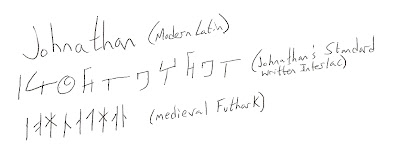
I really can't get over the unnecessary complexity of these letters. Let's try an experiment: I'll write my name in a few different alphabets. ready?
Ignore the slantiness, please. I gotta say: it was a hell of a lot easier to write my name in ancient runes than in Interlac. It doesn't look quite as pretty as usual there, does it? Maybe all the people of the future write with fat markers or giant calligraphy pens or something.
In any case, Interlac is completely
NOT APPROVED


